-

Mobile Site Audit: A Practical Guide to Better Performance and Usability
Mobile Site Audit: A Practical Guide to a Better Mobile Experience Most people now browse the web on a mobile device, whether they are researching a product, reading an article or booking a service. A website that is slow, difficult to navigate or hard to read on a small screen can quickly drive visitors away.…
-

Mobile SEO Packages: A Practical Guide to Better Rankings on Smartphones
Mobile SEO Packages: What They Include and How to Choose More people than ever use mobile devices to search, browse and shop online. A website that is difficult to use on a phone can frustrate visitors and make it harder for search engines to understand and rank its pages. Mobile SEO packages are designed to…
-
Mobile SEO Audit: A Practical Guide to Better Rankings and User Experience
Mobile SEO Audit: A Practical Guide to Improving Your Website A mobile SEO audit checks how well a website performs in mobile search and how easy it is to use on a phone or tablet. It looks beyond whether a page fits on a small screen: it also considers loading speed, navigation, content, accessibility, technical…
-
Mobile Optimisation for Web Design: A Practical Guide to Better User Experiences
Mobile Optimisation for Web Design Mobile devices are central to how people browse, shop, work and communicate online. A website that is difficult to use on a phone can quickly frustrate visitors and drive them elsewhere. Mobile optimisation is therefore an essential part of web design: it helps a site work well on smaller screens,…
-
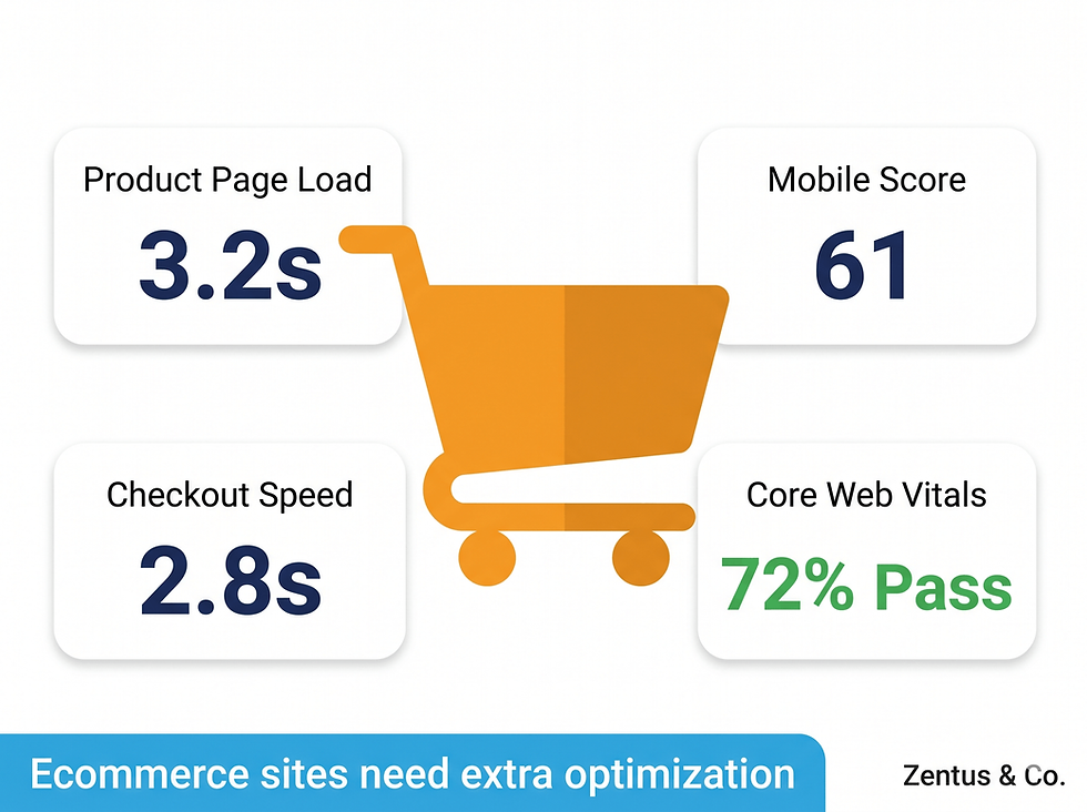
How to Optimise Wix Website Speed for a Faster, Better User Experience
How to Optimise Your Wix Website Speed A fast website makes it easier for visitors to find information, browse products and get in touch. It can also support a better overall user experience on mobile and desktop. If your Wix website feels slow, a few careful changes can often help. Website speed depends on several…
-

Why a Mobile and Tablet Optimised Site Matters
Why a Mobile and Tablet Optimised Website Matters Mobile phones and tablets are now a central part of everyday life. People use them to browse, shop, read the news and find local services, often while on the move. A website that works well on smaller screens makes it easier for visitors to find information and…
-
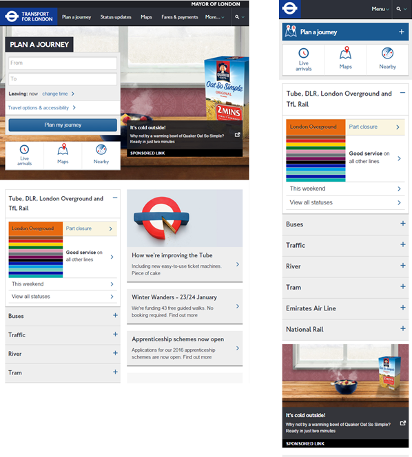
Website Not Optimized for Mobile: Signs, Solutions and Why It Matters
Website Not Optimised for Mobile? Here’s What to Do When a website is not optimised for mobile, it can be difficult to read, navigate or use on a smartphone. Visitors may have to zoom in to read text, scroll sideways to see a page or struggle to tap small buttons. These problems can frustrate users…
-
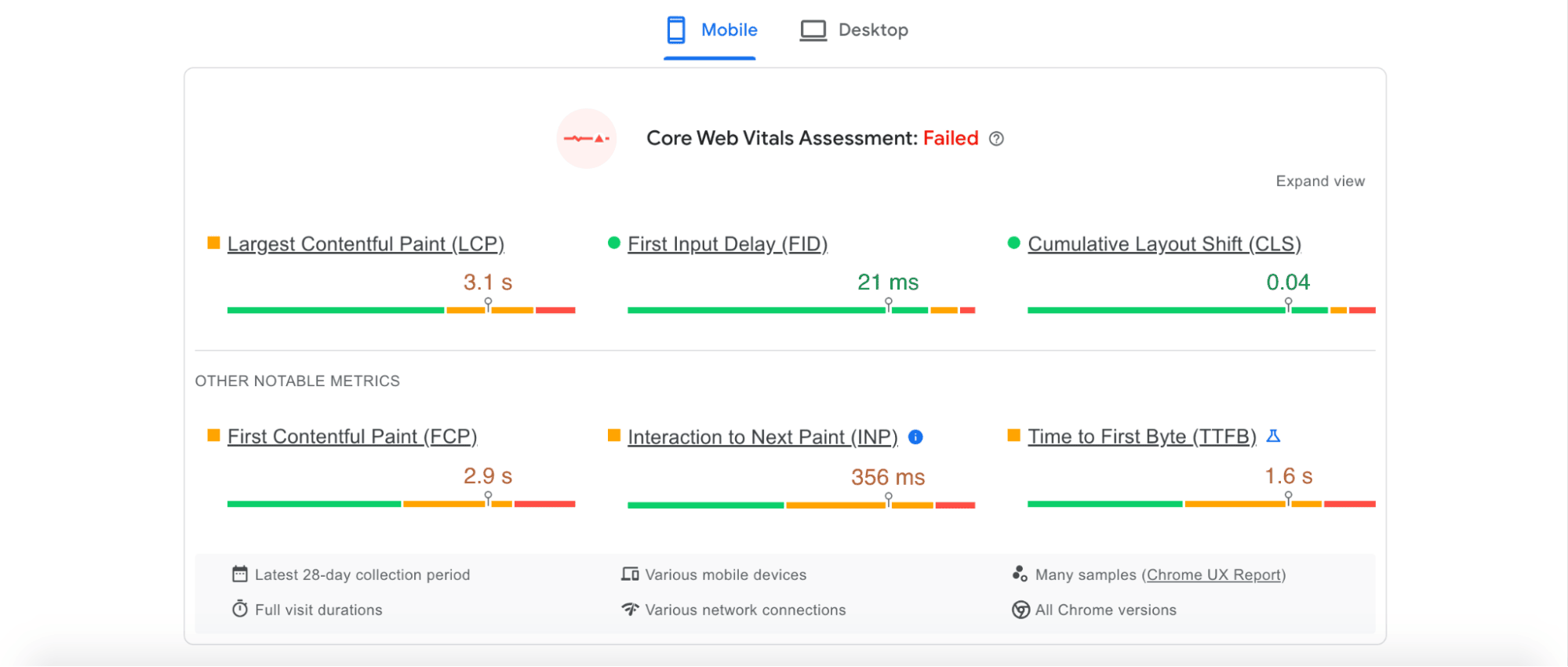
SEO Mobile-Friendly Test: How to Check and Improve Your Website
SEO Mobile-Friendly Test: How to Check and Improve Your Website A mobile-friendly website is easy to use on a phone or tablet. Visitors should be able to read the content, navigate between pages and complete tasks without pinching, zooming or struggling with controls. This matters for search engine optimisation (SEO) as well as user experience:…
-
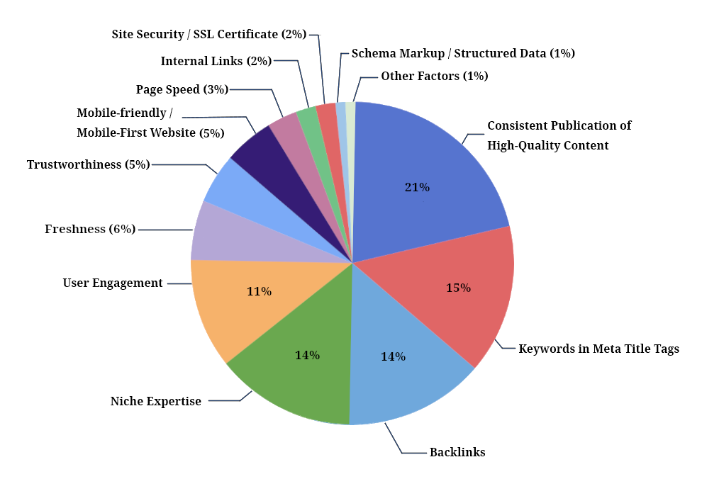
Mastering Mobile SEO Rankings: A Guide to Optimising Your Site for Success
Mobile SEO Rankings: Optimizing Your Site for Success Mobile SEO Rankings: Optimizing Your Site for Success In today’s digital age, mobile search has become increasingly important for businesses looking to reach their target audience online. With more users browsing the web on smartphones and tablets than ever before, ensuring your website is optimized for mobile…
-

Optimization of Web Pages: A Practical Guide to Faster, More Effective Websites
How to Optimise Web Pages for Speed, Usability and Search Web page optimisation is the process of making a website faster, easier to use and more effective for visitors. A well-optimised page helps people find information, complete tasks and enjoy a consistent experience across devices. It can also support search visibility, although no single optimisation…

googleamp.co.uk
Accelerating the Web