-
Mobile Optimisation for Web Design: A Practical Guide to Better User Experiences
Mobile Optimisation for Web Design Mobile devices are central to how people browse, shop, work and communicate online. A website that is difficult to use on a phone can quickly frustrate visitors and drive them elsewhere. Mobile optimisation is therefore an essential part of web design: it helps a site work well on smaller screens,…
-
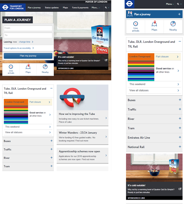
Website Not Optimized for Mobile: Signs, Solutions and Why It Matters
Website Not Optimised for Mobile? Here’s What to Do When a website is not optimised for mobile, it can be difficult to read, navigate or use on a smartphone. Visitors may have to zoom in to read text, scroll sideways to see a page or struggle to tap small buttons. These problems can frustrate users…
-

Website Mobile Optimization: A Guide to a Faster, More User-Friendly Site
Website Mobile Optimisation: A Practical Guide For many people, a mobile phone is the main way they browse the web. A website that is difficult to read, slow to load or awkward to use on a small screen can quickly drive visitors away. Mobile optimisation helps ensure that a website works well across phones and…

googleamp.co.uk
Accelerating the Web